Charities searcher
I decided to replace my previous projects from personal website to the Behance. This project is a student one for Coursera by Google UX design course. Enjoy!
Created: November - December, 2022
My role: I was working solo on this project as a UI/UX designer, so I am responsible for the entire process, that included competitive analysis, paper and digital wireframing, low and high-fidelity prototyping, usability studies, iterating on designs and responsive design.

About
Charities searcher helps people to find local charities (as well as worldwide) where they can make a donation (money, items) or sign up for a volunteer job. Here one can easily find information about charity cases and charity organizations, and do good just in a few clicks. Charities searcher is a dedicated mobile app + Website version.
The problem
The problem is that people usually don't know the needs of a community, and they are usually too busy to do research. They have no idea where they can donate items, or which charity needs money right now to help those in need. There are only a few charity aggregators that suggest a full list of charities, both local and worldwide.
The goal
The goal is to create an app (+website) that helps people quickly and easily find local charity organizations and make donations in a few clicks.
1. Competitive audit
Before starting any of my designs, I conduct competitive audit. It helps me to understand what’s going on in the field, what are the main products are suggested to users, what is the problem our competitors are trying to solve.
💡 Findings
The main problem is that there are only a few charity aggregators, and most of them serve as databases only. You cannot donate money directly from their websites - you should go to the specific charity organization's website for that.
Often times, small charities don't have a website, only Facebook groups. In this case, it is impossible to donate money or fill out the volunteer form online. One should make a call or visit the organization in person, which takes time.
I believe that if we make it easy to donate, people will do it more often.
2. User research
As it is a study case and I had no possibility to make a great research, I interviewed my family member and friends. So here some pain points they had faced:
- Some people don’t know about charities’ databases, they find info about charity cases from the TV news or from their colleagues;
- Some local charity organizations are to small and don’t have a website, so it is hard to help them remotely.
☝ Conclusions
The main goal for a charity org is fundraising and making everybody know about their activities. They must be heard in order to help those in need. The more people know, the more people would be involved in help. The goal cannot be reached, if a website doesn’t involve interaction with users.
3. Mobile app map

4. Mobile app digital wireframing
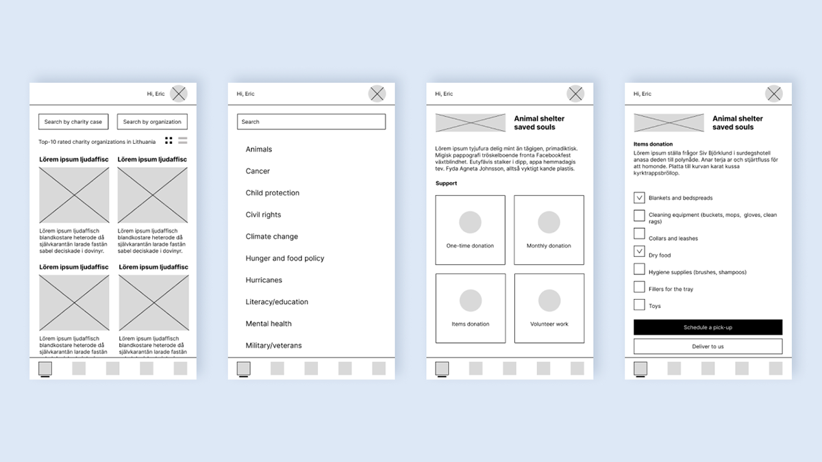
I wanted to make it easier to find an organization to donate to, which is why I decided to create two search buttons. One is for searching for charities related to specific causes (such as human rights, hunger, and food policy), and the other is for searching for organizations by name.
On a charity organization page you can see 4 buttons for different actions:
1. one-time donation,
2. monthly donation (subscription),
3. item donation and
4. volunteer work.
How it works: The organization provides us with the types of donations they accept, and using this information, we add or remove buttons. For example, if the organization only accepts money donations, there will be only two buttons on the charity organization page - one-time donation and monthly donation.
The app works as a catalog for charity organizations and looks nice!
5. Mobile app usability studies
There were some findings in usability studies:
1. Users don’t need view switcher (grid-list view) (I thought it’d be a nice feature, but it really useless here).
2. Users want easy access to the local charities first of all (It was hard to implement a switcher from local charities to worldwide. The initial idea was to set them in a low tab bar, but it was too confusing for users).
3. Users need a possibility to add to favorite some charity organizations, so they could easily find them ( I totally forgot to add favorited buttons to cards…that is why designers conduct usability studies!).
6. Mobile app - improvements

7. Mobile app hi-fidelity prototype
5 iterations later, I managed to improve the flow and make it smooth, easy, and clear. Click below to experience the flow for yourself! Tap here
*Note: All the organizations represented in the app are real (with the exception of Saved Souls - my previous project). All the information about these organizations was taken from their websites.

8. Website hi-fidelity digital wireframing
It was easier for me to make a web version after a mobile app. The user flow is defined, and the sticker sheet is almost ready. The only challenge is to create a good layout that represents the main functionality.

Main page, desktop 1400 pt

Charity organization and Donate items pages, Desktop 1400 pt

Tablet 834 pt and Mobile 375 pt web versions
9. Style guide
I choose contrasting colors that emphasize the main idea of a product. Blue is usually associated with peace, while red shows importance and urgency. I also created a style kit for developers to make their work easier, as well as mine :)

10. Future plans
Sincerely, it was a challenging task for me, but I'm proud of the outcome. Of course, there are always areas that can be improved. I suppose I'll come back to the project later to take a fresh look at it and decide on the next improvements.
Thank you for watching my work, I always happy to receive comments! Don’t be shy to write me, I highly appreciate any feedbacks!
© Anna Radevich, 2023
